Finlandia
Concierge, a travel agency startup, hired me to design their Berlin guide. It was a very small map that was meant to fold and fit in your back pocket.

Finlandia: Ice cold truth.
Challenge
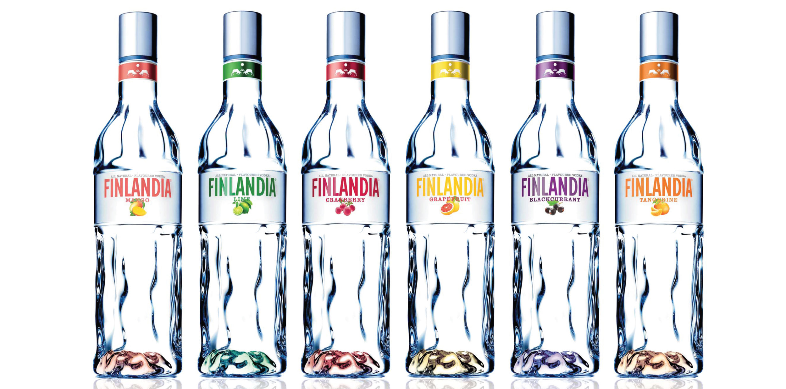
In the world of spirits, the bottle rules. Everything about it… form, glass quality, functional characteristics – they all work together to carve out an exclusive space in the category landscape. Finlandia needed a bottle capable of justifying its premium price in core markets of Poland, Russia, and the Ukraine – one that would resonate with contemporary vodka aficionados and accrue emotional dimensions to the brand.
Approach
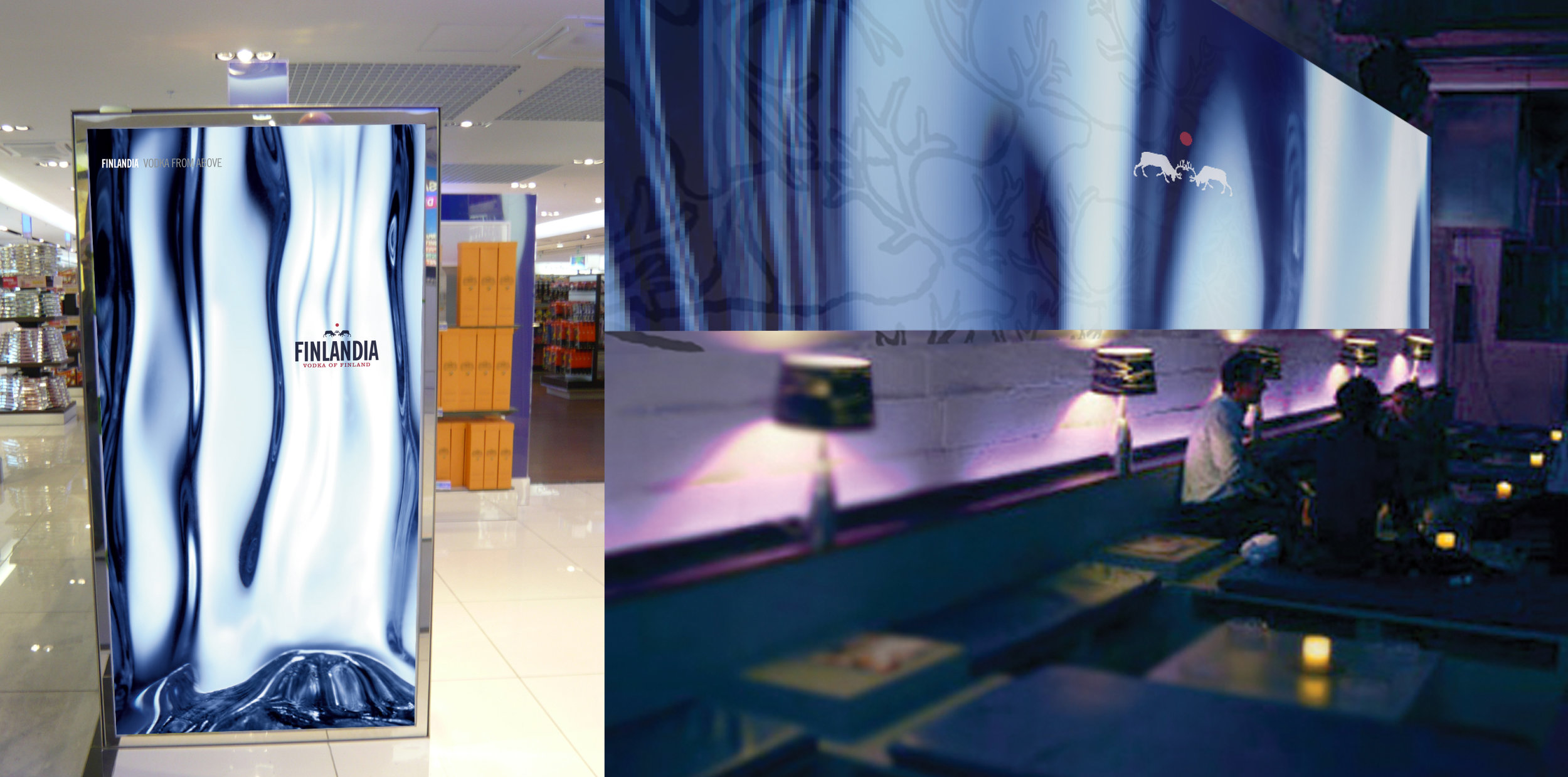
A simple, authentic metaphor can snap a brand into focus, both internally and for its customers. For Finlandia, that symbol was ice – a core brand equity and a central motif in Finnish design. Pure yet fleeting, constantly in flux, ice requires you to engage and appreciate its natural beauty instantly, for in seconds it will change... and in minutes, exist only in memory, much like life itself. A central metaphor of ice provided a crucial, extensible foundation for our bottle design; one that could readily be iterated across various marketing initiatives, print and digital executions, and other consumer touch points. This persistent representation of glacial purity prepared consumers to embrace the more emotional ideals of the brand associated with pure living. It inspired them to see beyond the functional and engage on a deeper, more emotional level.
Results
2012 10% Portfolio growth. Finlandia became the number one imported spirits brand in Russia and grew 61% in volume adding over 100k case growth. 2013 12% Emerging markets growth in underlying sales.


